
Iconic Record Covers Throughout the Decades: The Best Album Art from the Late 60s to the Early Noughties

Vinyl records have recently made a comeback and, while the Hipster subculture has played a big part in it, they are by no means responsible for this nostalgic trend. True connoisseurs have always favoured records over CDs and digital resonances thanks to an imitable sound quality and the accompanying ritual that tickles so many senses. It starts with a very tactile sourcing method: the flipping through vinyls in immaculately organized record bins/shelves at record stores straight out of High Fidelity, at specialist markets, at home or your music-nut of a friend’s house. Once the selection has been made, fingertips gingerly trace every detail of the cover while the eyes feast on an original album cover design.
Then comes the big moment. Discarding the plastic wrap and finally breathing in the record’s genuine scent, this round object of infinite, orgasmic, musical pleasure is extracted and carefully placed on the turntable. Naturally, the whole area around the record player – which stands like a shrine in the room – is dedicated to this very ritual, with soft arm chairs, pillows, headphones, blankets, drinks or spliffs all within easy reach, so as to never once break the energy within the beautiful universe that is about to be created with the first beat of a drum, the first strum of a guitar. The familiar crackling sound upon the initial contact between needle and vinyl warms is a delight even to modern ears, and the music that finally spills from speakers, will give you everything you desire from that moment.
While music is obviously the most important part of the vinyl experience, one mustn’t forget about the many hours spent studying the respective album cover’s art and design. It is a part of the ritual, one that spurs on a deeper relationship with, and a new perspective on the music that inspired the art. The album art is every bit a reflection on the cultural narrative as the music itself, not just in terms of style but depiction. Looking back at iconic record covers spanning from the late sixties to the early noughties, one witnesses the evolution of fashion, the gender binary, socio-political climates and design preferences.

Art by Andy Warhol
The Velvet Underground & Nico, 1967 – Art by Andy Warhol
It is immediately recognizable – if not as an Andy Warhol print, then as the Velvet Underground’s debut album. The simple, vibrantly yellow print of a banana has become somewhat of a logo for a band that was far removed from San Francisco’s colourful hippy scene, and deeply immersed in The Factory, Warhol’s studio in New York City – a whole other style, a whole other genre of art and debauchery. As The Factory’s house-band, Lou Reed, Nico and co. were the musical poster-children of New York’s art scene, and the banana neatly packaged it as such. Earlies copies of The Velvet Underground & Nico featured a sticker on top of the print, with a message that teased owners to “peel slowly and see”. Removing the sticker revealed a flesh-toned, skinless banana with a slightly disturbing neon glow.

Designed by Richard Hamilton & Paul McCartney
The Beatles “White Album”, 1968 – Designed by Richard Hamilton & Paul McCartney
If you’re familiar with The Beatles’ 1968 self-titled album, you may be surprised it merits a mention on this list. After all, it is often referred to as the “White Album” for a reason. It is a legendary album packaged in unassuming white sleeves, with the band’s name blind embossed in a Helvetica font – that’s it. A complete shock to the system considering it succeeds the plethora of colours on Sgt. Pepper’s Lonely Hearts Club Band designed by Peter Blake. But that’s exactly what makes the White Album so genius; in a sense it marks The Beatles’ move from pop to something rawer and more experimental, playful in its combination of genres and eastern influences, without loudly announcing it to the world. The album came with a poster comprising a montage of portraits of the band, featuring the lyrics to the songs printed onto the back.

Art & Design by Andy Warhol, Billy Name and Craig Braun
The Rolling Stones – Sticky Fingers, 1971 – Art & Design by Andy Warhol, Billy Name and Craig Braun
Despite the Beatlemania epidemic, parents weren’t too worried about sending their teens to a Beatles concert. They were the good guys of rock’n’roll. Attending a Rolling Stones concert on the other hand, was cause for parental discussions. They were clearly the bad boys of rock and they wanted everyone to know it too. And what better way to put the fear of God into a mother desperately reliant on her little helpers, than rubbing the outline of a big, voluptuous penis in their face by ways of their chosen cover art for Sticky Fingers. This album, which also happens to feature the first use of the Stones’ famous tongue and lips logo on a cover, is as sex, drugs and rock’n’roll as it gets and the combination of Warhol’s provocative photography and the newly-featured logo, somehow evokes fantasies of Richards and Jagger in their hey-days. One almost wants to believe that the visible bulge belongs to either one of the glimmer twins. Alas, the actual zipper that unraveled the album sleeve, never revealed such identities.
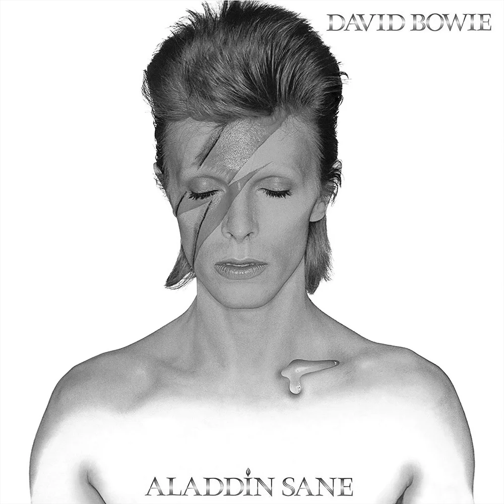
Photography by Bryan Duffy
David Bowie – Aladdin Sane, 1973 – Photography by Bryan Duffy
David Bowie adopted many personas and pseudonyms throughout his career but the one most widely recognized, is definitely Ziggy Stardust. Now, when we think of David Bowie, we think of his face adorned with the iconic red and blue lightning bolt that became synonymous with Ziggy Stardust with the release of his 1973 album, Aladdin Sane. Bowie’s manager at the time, Tony Defries, was determined for the album cover to become somewhat of a brand to convince the industry of his increasing fame – hiring Duffy for the job was a no-brainer. The lightning bolt came about in a fit of spontaneous inspiration when Duffy and Pierre Laroche spotted a similar logo on a rice cooker. It took them an hour and a good dose of red lipstick to perfect the look, and it was obviously worth it. The album itself may not have been a great success but the cover art is undeniably one of the best in rock history and will forever remind us of one of the greatest singer songwriters and style icons of our time.

Photography by Robert Mapplethorpe
Patti Smith – Horses, 1975 – Photography by Robert Mapplethorpe
There are several things that make the cover art on Patti Smith’s timeless album, Horses, incredibly special. It captures Smith’s tentative but daring spirit so perfectly; defying in her posture and androgynous look, a gentle look in her eyes, softening her outward stance and focusing it inward. Photographed by Robert Mapplethorpe, her first love and dearest friend, one can feel the intimacy it took to capture who she really was at this particular moment in time. It was one of the first cover images of a female artist not posing in an overtly feminine, girlish manner. This image is as enduring as the album itself and is a testament to Smith having always stayed true to herself, her style and her beliefs.

Photography/Art by Jean-Paul Goude
Grace Jones – Island Life, 1985 – Photography/Art by Jean-Paul Goude
Another album cover steeped in tumultuous, romantic history, is that of Grace Jones’ Island Life. Anatomically incorrect, hypersexualized and executed to offer a “credible illusion”, the photograph of Jones in a terrifyingly elegant arabesque pose gives off an undeniably eighties vibe. It’s fitting, seeing as Jones’ character is as volatile as was the era itself. Goude, who was attracted to her knack for being “beautiful and grotesque at the same time”, used an old school photoshop method that consisted of creating a composition made up of a collage of the same image taken from different angles; this allowed him to twist and elongate her body into this mind-boggling pose, then paint in the missing pieces. Out of all the albums on this list, this probably had the most creative process and is most likely to keep first-timers Grace’s pose for a good while.
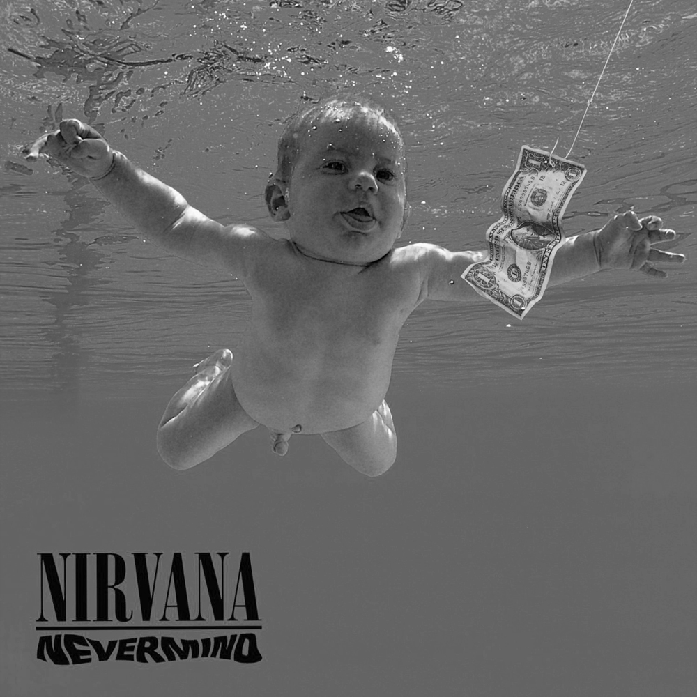
Photography by Kirk Weddle
Nirvana – Nevermind, 1991 – Photography by Kirk Weddle
Babies don’t tend to be exactly memorable to most people, unless, of course, they’re your own. Or, the baby on the album that shot Nirvana to fame, namely Nevermind. Kurt Cobain had some strange ideas in his lifetime, and his art was known to reflect this. But he couldn’t get an album cover depicting an actual water birth passed his reps at Geffen Records; so, he settled for a naked baby instead. The label wasn’t too excited about a baby’s penis on the cover either, but Cobain insisted the only way he’d allow it to be censored, is if it was done using a sticker reading: “If you're offended by this, you must be a closet pedophile.” And so, the Nevermind album was born thanks to photographer Kirk Weddle and his friend’s son, Spencer Elden, who was four months old at the time. The dollar bill on the fishhook was added in later, perfecting what has undoubtedly become a classic cover image.
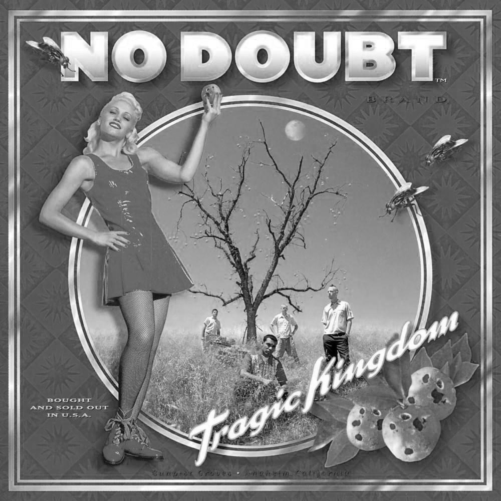
Photography/Art by Daniel Arsenault
No Doubt – Tragic Kingdom, 1995 – Photography/Art by Daniel Arsenault
Featuring one of the break-up songs of the nineties – Don’t Speak – No Doubt’s Tragic Kingdom remains the band’s best album. Recorded and released during a rocky period that saw Eric Stefani leave the band and Tony Kanal and Gwen Stefani break up, their personal, crazy rollercoaster of emotions contributed to the success of the album. The album art, created by Daniel Arsenault, is a preview of that punky plastic nineties look many bands went on to follow. Picturing Gwen at the forefront, posing with a rotten orange, the rest of the band members melt into a round, framed background surrounding an orange grove, paying homage to Orange County, where they all grew up. It set the tone for the VH1, Viva and MTV aesthetics of the nineties and a new genre of punk/ska pop.

Art by Kenny Gravillis
The Roots – Things Fall Apart, 1999 – Art by Kenny Gravillis
Marie Elsie St. Léger described it best when she said, “Few albums manage to simultaneously be this informative, political, and downright groovy”. The Roots have always known how to cleverly package sobering observations and hard truths in rhythmic melodies and hypnotic beats and yet, Things Fall Apart stands out as a tight narrative that flows perfectly. While the main image available on the album today features a black and white picture by an unknown photographer, capturing a black woman running from the police during a Brooklyn riot in the 1960s – a candid shot – there were four limited editions of the album featuring four different images. The three others are: “The Ace in Hand” by Bettman in 1931, showing the hand of the murdered mob boss, Giuseppe Masseria, holding the card in his hand; an eerie image of a firefighter standing amidst the debris of church fire; a “Baby in the Rubble” in the throes of the war in China in 1937, by H.S. “Newsreel” Wong, and Peter Turnley’s “Crying Child”, capturing the famine crisis in Somalia in 1992.
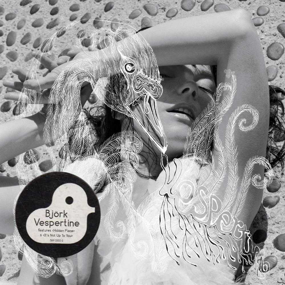
Photography/Art by Inez van Lamsweerde, Vinoodh Matadin and M/M (Paris)
Björk – Vespertine, 2001 – Photography/Art by Inez van Lamsweerde, Vinoodh Matadin and M/M (Paris)
Laying on the ground next to a pool, her arm dramatically resting on her forehead, shielding her eyes from the Californian sun, the famous Marjan Pejoski swan dress draped over her shoulder and bare chest, Björk has managed to shock us once again – this time with her subtleness. The cover art photographed by Lamsveerde and Matadin and illustrated by M/M (Paris), is warm and lustrous. And yet, once the music accompanies our viewing pleasures, we crave the cold, intimate solitude of winter and its wonderland romances. Staring at this photograph whilst listening to Vespertine in its entirety, you will come to think of the unique force that is Björk, as an Icelandic mermaid exploring new sounds – including the shuffling of cards and the cracking of ice –, lyrical sources and muses such as Harmony Korine.

Art by Adde Russell
Death Cab for Cutie – Transatlanticism, 2003 – Art by Adde Russell
Death Cab remains many a writers’ go-to band for a nocturnal scribbling soundtrack. Their sound is soft and stirring, their lyrics deep, poetic and strangely motivating, even in discussing “emo” topics such as dysfunctional relationships and the like. Transatlanticism is full of beautiful relationship despair brought on by the transatlantic distance between two lovers. The cover art by Adde Russell, depicts a Poe-esque crow against an aged, crinkled background, red wires entangled around its beak and lower body. While some have likened it to the crow in The Secret of NIMH, personally, I think the tangle of wires represents the technology needed to nurture long-distance relationships and how, without physical contact or intimacy, words can quickly become obsolete, a tangle of empty sounds if you will. The band clearly vibed with Russell’s work, as they went on to hire her for the artwork on their 2005 album, Plans.

Art by Michael Brophy
Sleater Kinney – The Woods, 2005 – Art by Michael Brophy
For any good band there comes a time when they feel a need to challenge themselves and their fans by moving out of their comfort zone and exploring themes that move them, even if these don’t speak to the masses. This is what neo-riot grrrl indie rock band Sleater-Kinney did with their 2005 album, The Woods. NME described it as a “radical unspooling of their sound” that garnered a divided reception from listeners – even those who had been loyal to the band since their beginnings – which is exactly why, by now, it actually stands out as an unapologetic, Sleater-Kinney classic. The cover art by Michael Brophy is a visual metaphor – a surreal, Twin Peaks-esque painting of a forest growing out from under a stage, the red curtains sparking anticipation – that speaks of Sleater-Kinneys abandonment of music as a performance in favour of following their instincts.

author Roxanne Sancto
Roxanne Sancto is a freelance writer specializing in pop culture, often with a feminist twist. She adopts a new pet every time she goes out on a walk. www.roxannesancto.com