Learn Lynch, Learn Cinema: Understanding the Artists’ Gaze on Twin Peaks
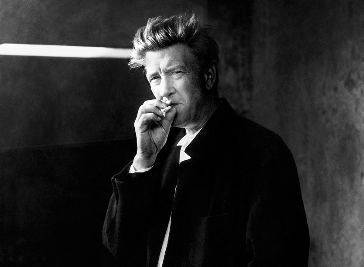
David Lynch, an American filmmaker, painter, musician, actor, and photographer
In a sense, Twin Peaks is the easiest of Lynch’s works to get into as it dabbles with so many different forms of storytelling. Not all middle-aged couples whose Sunday nights revolved around this strange little town in the 1990s, will find the same fascination with the director’s big-screen works such as Lost Highway or Inland Empire. What made Twin Peaks accessible to a broader audience, is the unique combination of surrealism and a crime-case plotline in a campy, soap opera setting that thrives on eccentric characters and 80s horror tropes.
One of the greatest worries on the minds of many, was whether Twin Peaks: The Return would use the same opening credits as it did in the past – that’s how iconic an intro it is. From the first notes of Angelo Badamenti’s dreamy composition, Falling, to the font reminiscent of eighties, alien-invaded horror movies; from the picturesque, unrushed sweep over a sleepy, milling town, to the famous bird that has become synonymous with the show, these were all an indispensable part of the series and not merely a teaser. It acts as a landing point: a (transcendental) meditation that allows viewers to let go of their day and truly immerse themselves in the feeling and atmosphere that is Twin Peaks. Without it, it’s almost like ordering a slice of homemade cherry pie without a cup of damn hot Joe. The pie works good on its own; but it’s just so much better with the coffee combo.
Alas, The Return opened to a different intro, one that was still recognizably Twin Peaks with its ominous mists over the Washington landscapes and the waterfall we know so well, red curtains vaguely blowing in the breeze and Laura Palmer’s face still haunting the town in 2017. But it’s just not quite the same. In the original opening sequence, Lynch’s play with the autumn-kissed, natural colour tones of the American west worked in harmony with the industry that drives it. Each shot is significant to the mystery and the warm sense of familiarity the viewer is being sucked into and, unfortunately, this does not come across in The Return’s opening titles. As is expected from Lynch, however, he more than makes up for The Return’s subpar opening by allowing each episode’s establishing shot to act as an appetizer for the main events to come – in other words, he has simply found a different structure to his visual meditation. And it works.
The Return is a slow-burner that has reconnected audiences with the true meaning of a cinematic experience in a TV scope, one that has been forgotten by a new generation of viewers who crave fast-paced, explosive, shiny and glossy optics that lack feeling and depth. By inviting his public to get stuck on seemingly decorative details, Lynch is doing much more than hiding Easter eggs. He is granting you access to the very essence of this town by ways of an engrossing experience, seducing you with new angles and perspectives on things and places that are not always what they seem.
A great example of this in The Return, is Part 3: Call for Help’s striking establishing shot of the New York skyline and the gentle descent into its abyss before slowly panning up and along the skyscrapers that tower over the city as menacingly as they are protectively. So many films and series like to incorporate the backdrop of this very city as a breather between scenes, but no one has dared to challenge its versatility quite like Lynch before.
In Twin Peaks Laura’s Secret Diary, he highlights Leland’s mental state by letting the camera travel through the police building’s organs, out of the vent and into the interrogation room, leading the viewer deeper into the fragmented realms of his psychosis. Once the camera rests on his face, it’s almost as though the viewer is already anticipating his crumbling breakdown. In Lynch’s work, architecture, thus, serves multiple purposes, and often reflects the blueprint of his characters’ emotional household.
In the cult series – then and now with its return, 25 years later – it’s not so much about what the characters say, but what their body language and actions transmit. At times subtly, at times a shock to the system, visually and audibly – think Sarah Palmer’s incessant screaming in the pilot episode or the stoically poetic Fireman and Señora Dido in Part 8: Gotta Light? on The Return.
The art of captivating an audience with a two-and-a-half-minute scene of a man sweeping the floors of the Roadhouse – and making it memorable – is what real cinematography is all about, and it’s one Lynch has mastered following his own gaze and spiritual callings. As over the top or downplayed as his eclectic mix of characters often are, he insists on the viewer’s investment – sometimes even by poking fun at them with a sense of humour only he fully understands.
David Lynch created a whole new way of watching TV: one that requires patience, focus and detective work, and inspires meaningful, creative conversations. In turn, this generated a fiercely loyal and charmingly weird fanbase whose love for the show is not just a symptom of nostalgia, but a celebration of complex writing and visual art that cannot be followed without an open mind. This craving has inspired new directors and creators to bring us shows like Lost, The Leftovers, Carnivàle and The OA, and their followers are enjoying the same sense of community and a united quest for answers as the “Peaksies” before them. Yes, in a mind-numbing TV climate, the Lynchian school has become a couch-potatoes’ most exquisite form of mental exercise.
author Roxanne Sancto
Roxanne Sancto is a freelance writer specializing in pop culture, often with a feminist twist. She adopts a new pet every time she goes out on a walk. www.roxannesancto.com


